Overview
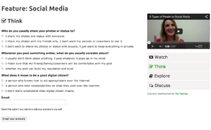
This page will explain how to create a learning wrapper for your video. Learning wrappers allow you to "wrap" the video with learning support resources - such as self assessment quizzes, questions for reflection and discussion, additional links for deeper exploration, etc. Our learning wrapper template is mobile friendly and can be applied to any UBC CMS (Content Management System) Websites. To see the learning wrapper in practice, check it out on the Digital Tattoo website.
Please note that this template is only tested on the newest UBC CMS template theme, so some of these features may not work well on the older UBC CMS websites.
The default learning wrapper template is divided in 4 major components which are:
- Watch - where you will be embedding your video, including YouTube and Kaltura videos.
- Think - where you will be embedding your quiz created through Gravity Forms
- Explore - where you will be adding additional learning materials and any other external/internal links.
- Discuss - where you will be adding a discussion question.
Since the wrapper is a customizable template, you can easily add or remove any of these components to suit your needs. For more information on how to customize, see Customizing the Learning Wrapper below.
Install
To add Quizzes on the Think page, make sure to activate Gravity Form plugin. For information on activating and using Gravity Forms, see the documentation here. If you want to add comment section within the Discussion tab, contact http://support.cms.ubc.ca/ to activate Display Comments Shortcode plugin.
Adding CSS
You can choose to add your CSS and JavaScript anywhere in your site. For example, you can put your CSS to [Documentation:UBC_Content_Management_System/How_to/How_do_I_add_custom_CSS_to_my_site%3F Custom CSS] . In the instruction below, you will add the CSS and JavaScript under Global Theme Option.
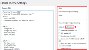
3. Go to Dashboard> Global Theme option. Under Custom CSS, copy and paste the CSS below. Then press save
4. Copy and Paste the following CSS to your Custom CSS.
/*Learning Wrapper CSS*/
/*Learning Wrapper CSS- Navigation Start*/
.select {
    color: #009900;
/*changes color when you select the menu*/;
}

ul.LWtab {
    margin-left: 0;
    margin-top: 20px;
    font-size: 23px;
    color: #363636;
}

ul.LWtab li {
    list-style: none;
    line-height: 30px;
    display: block;
    background: #F5F2F2;
 /*sets a background color of the menu*/
    padding: 10px;
    margin-top: 3px;
}

ul.LWtab li:hover {
    background-color: #EDE8E8;
/*It changes background color when you mouseover the menu*/
    cursor: pointer;
}

.disnon {
    display: none;
}

.LWsidebar {
    display: block;
    width: 100%;
    float: right;
}
/*Learning Wrapper CSS- Navigation End */
/*Learning Wrapper CSS - Main Content Start */
.maincontent {
    display: block;
    float: left;
    width: 100%;
}

.content_wrap {
    width: 95%;
}

/*Learning Wrapper CSS - Main Content  End*/
/*Learning Wrapper CSS - Display comments Plugin CSS - Start*/
.display-comments-shortcode .comment .children {
    margin-left: 0;
}

.display-comments-shortcode #comments {
    list-style: none;
    margin-right: 28px;
}

.display-comments-shortcode li {
    list-style: none;
}
/*Learning Wrapper CSS - Display Comments Plugin CSS -End*/
/*learning Wrapper CSS - Mobile view -  Start*/
@media (max-width:767px) {
    .LWsidebar {
        display: block;
        width: 100%;
        float: left;
    }

    ul.LWtab li {
        list-style: none;
        padding-left: 5px;
        padding-right: 5px;
        padding-top: 4px;
        padding-bottom: 4px;
        font-size: 16px;
        float: left;
        margin: 2px;
    }

    .content_wrap {
        width: 100%;
    }

    .maincontent {
        display: block;
        float: left;
        width: 100%;
    }

    ul.LWtab li.hidemobile {
        display: none;
    }
}
Adding Javascript
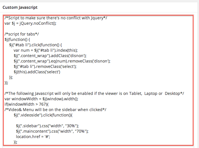
5. Under JavaScript, copy and paste the JavaScript below. Then press save
/*Script to make sure there's no conflict with Jquery*/
var $j = jQuery.noConflict();

/*script for tabs*/
$j(function() {
    $j(".LWtab li").click(function() {
        var num = $j(".LWtab li").index(this);
        $j(".content_wrap").addClass('disnon');
        $j(".content_wrap").eq(num).removeClass('disnon');
        $j(".LWtab li").removeClass('select');
        $j(this).addClass('select')
    });
});

/*The following Javascript will only be enabled if the viewer is on Tablet,  Laptop or  Desktop*/
var windowWidth = $j(window).width();
if(windowWidth > 767){
/*Video& Menu will be on the sidebar when clicked*/
        $j(".videoside").click(function(){

          $j(".LWsidebar").css("width", "30%");
          $j(".maincontent").css("width", "70%");
          location.href = '#';
        });

/*Video& Menu will not be on the side bar when clicked*/
 $j(".videobig").click(function(){

          $j(".LWsidebar").css("width", "100%");
          $j(".maincontent").css("width", "100%");
	  location.href = '#';

        });

}
Adding HTML
6. Copy and paste the following HTML Code to your page. Make sure that you are on Text mode when you adding the following HTML.
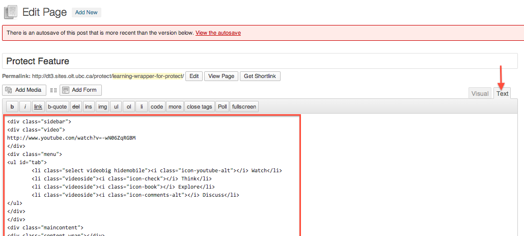
<div class="LWsidebar">
<div class="video"><div class="responsive-media">
video here
</div>
</div>
<!--Side Navigation Menu-->
<div class="menu">
<ul class="LWtab">
	<li class="select videobig hidemobile"><i class="icon-youtube-alt"></i> Watch</li>
	<li class="videoside"><i class="icon-check"></i> Think</li>
	<li class="videoside"><i class="icon-book"></i> Explore</li>
	<li class="videoside"><i class="icon-comments-alt"></i> Discuss</li>
</ul>
</div>
</div>
<div class="maincontent">
<div class="content_wrap">


</div>
<div class="content_wrap disnon">
<h2><i class="icon-check"></i> Think</h2>
Gravity Form here

</div>
<div class="content_wrap disnon">
<h2><i class="icon-book"></i> Explore</h2>

Add a content for the Explore Page here

<h3><i class="icon-link"></i> Additional Resources</h3>
Link feed here


</div>
<!-- Content for the Discussion section-->
<div class="content_wrap disnon">
<h2><i class="icon-comments-alt"></i> Discuss</h2>
add discussion question here
</div>
</div>
HTML explanation
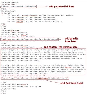
Click on the image on the right to see the color coded explanation of how the Learning Wrapper is used in the Digital Tattoo Webiste. Typically, when you are creating a content, you only need to manipulate the part highlighted in red. I will explain more in details below.
Adding a video
Copy and Paste the embed code of your video you want to add in between <div class="video"> and </div>. Make sure you are in the text (HTML) mode.
For example:
<div class="video"><div class="responsive-media">
<iframe width="420" height="315" src="//www.youtube.com/embed/YRxKsCHobRo" frameborder="0" allowfullscreen>
</iframe></div>
</div>
If you want to embed a Kaltura video, see Documentation:Kaltura/Embed a Video(How To)
Adding a quiz (Gravity Form) For the think section
Add the gravity form by clicking on the button highlighted in red

in between: <!--Content for the Think section--> <div class="content_wrap disnon"> and </div>
For example:
<!--Content for the Think section-->
<div class="content_wrap disnon">
<h2><i class="icon-check"></i> Think</h2>
[gravityform id=12 name= Self Assessment title=false description=true]<!--Add Gravity forms here-->
</div>
On instruction on how to create a Gravity Form, see the documentation on Gravity Forms here.
Adding a content for the explore section
You can add a link in between <h2><i class="icon-link"></i> Links</h2> and
For example:
<div class="content_wrap disnon">
<h2><i class="icon-link"></i> Links</h2>
<ul>
<a href="http://www.google.ca"><li>Google</li></a>
<a href="http://learningcommons.ubc.ca"><li>Learning commons</li></a>
</ul>
</div>
Add a link here
</div>
Adding a comment section inside the Discussion
Add your discussion question inbetween inbtween <h2><i class="icon-comments-alt"></i> Discuss</h2> and </div> . So For example:
<pre> <h2><i class="icon-comments-alt"></i> Discuss</h2>
What is your thoughts on Digital Identity? Comment on this post to start the discussion . </div>
Using the Display Comments shortcode plugin
If you have activated the Display Comments shortcode plugin,and you would like to move the UBC CLF comment section inside the Discussion Learning Wrapper, add [display-comments] inbtween <h2><i class="icon-comments-alt"></i> Discuss</h2> and </div> .
For example:
 <h2><i class="icon-comments-alt"></i> Discuss</h2>
[display-comments]
</div>
Customizing the Learning Wrapper
How do I change the color scheme of the Learning Wrapper?
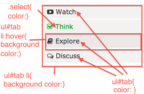 In order to change the color scheme, you will need to edit the CSS through Custom CSS. The picture on the left is a very brief diagram on where to make changes on CSS for each part of the color scheme.
Changing the background color of the menu
ul#tab li{
    list-style:none;
    line-height:30px;
    display:block;
    background:#F5F2F2;/*Change the background color here*/
    padding:10px;
    margin-top:3px;
}
In order to edit the background color, edit the background in the CSS above. For example, if you want to change the background color of the menu to blue, change it to: background: blue; .
You can also change the background color of the tab when the mouse hovers over by editing the CSS below:
ul#tab li:hover{
    background-color:#EDE8E8;/*Change the background color here*/
    cursor:pointer;
}
Changing the text color of the menu
In order to change the text color of the menu, edit the CSS below:
ul#tab{
    margin-left:0;
    margin-top:20px;
    font-size:23px;
    color:#363636; /*Change the text color here*/
}
Edit the color on the CSS above. For example if you want the text color to be red, change the CSS to color: red; .
You can also change the text color of the menu when the menu is hovered by editing the CSS below:
.select {
    color: #009900;/*change the text color here*/
}
How do I change the icons that are used in the Learning Wrapper?
See the instruction on how to add the icons here.
What if I want to add more links to the menu?
In order to do that, just add another
<li class="videoside"><i class="add icon class here"></i> New Links here</li>
in between <ul id="tab"> and </ul>
.For the list of icons and codes, see here
Then, add the following HTML between <div class="content_wrap"> and </div>
<div class="content_wrap disnon">
Add a content here
</div>
If you want to remove links from the menu, remove
<li class="videoside"><i class="icon you watn to remove"></i> Links you want to remove</li>
in between <ul id="tab"> and </ul>
Then remove the following HTML between <div class="content_wrap"> and </div>
<div class="content_wrap disnon">Content that you want to remove
</div>
Support
- Contact Rie NambaIf you have question related to the Learning Wrapper,
- If you have any questions related to UBC CMS, Javascript, CSS or HTML, visit the Wordpress Drop-in Clinic
If you are using not UBC CLF
If your website is not using UBC CLF theme, you can still follow similar process to create a learning wrapper. The HTML/JavaScript/CSS is available in gitHub .If you want to integrate the comment feature in WordPress with the Learning Wrapper (For example in here, install Display Comments plugin from the Github here
